Real-Time Data Marriage for Performance Insights
It’s dark and cold, and you’ve developed a sense of dread…
You’re not trapped inside a cave. You’re a victim of vanity metrics and unreliable data.
This goes the same for the entry-level marketer to the top executive presenting high-level performance metrics to board members or investors.
You cannot rely on native data (i.e., data derived solely from ad channels) to report performance up the chain of command.
Any digital marketer worth his/her weight in salt knows that tying native data to CRM data is crucial in measuring actual performance.
The problem is that many marketers aren’t able to produce real-time insights on valuable metrics for leadership.
For instance, what if X executive wants to understand cost-per-MQL and total spend across all platforms?
If you don’t have an exorbitant yearly subscription to a fancy data platform like Supermetrics or Impravado, you may not have a solution that provides the answer in real time.
Let’s fix that.
How to Marry Native and CRM Data for Free
This may not come as a shocker… FREE platforms exist to simplify data marriage.
You’ll just have to put in a bit of elbow grease.
For this exercise, we’ll focus on just ONE of these platforms, a data visualization tool called Google Looker Studio. You’ve heard of it, even if you think you haven’t.
Formerly known as Google Data Studio, a free version of the online tool for “converting data into customizable informative reports and dashboards” has technically been around since 2016.
In other words, this isn’t one of those “shiny” analytics tools from a startup that sprouted in the last few years. You can trust it to visualize data with over 30 chart types and configurations.
In honor of the popular “For Dummies” book series, we’ve broken down data marriage on Looker Studio into 5 simple steps:
Step #1: Set Up Looker Account
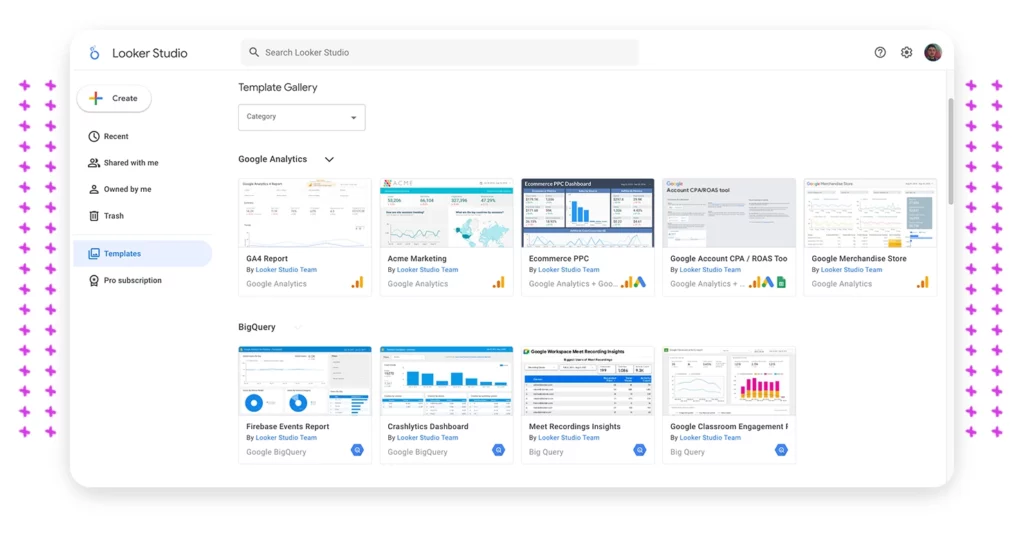
“The easiest step.”
To get started, log in to your Google account and make your way over to the Looker Studio Dashboard.
From here, you can choose from a variety of templates to kickstart your efforts. For the purpose of this walkthrough, we’re going to start from scratch with a “blank report.”
Pro tip: Search the template gallery for presets specific to certain platforms (i.e. Google Analytics).
Step #2: Configure Data Inputs
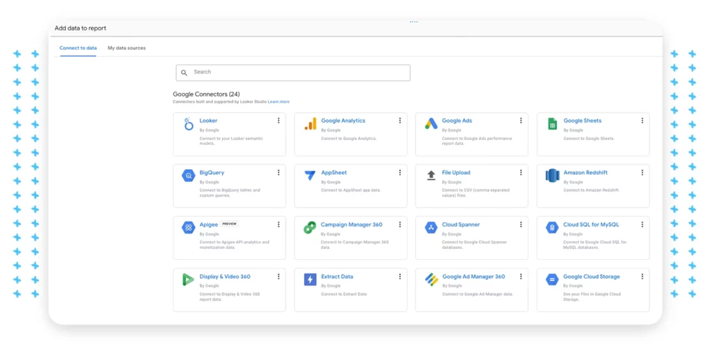
“Choose your platforms and add data inputs.”
Now, choose the data sources that will drive your insights. For example, if I’m running Google Ads, I can connect the ad account as follows:
Add Data > Google Ads > Select Account > Add
From here, we can visit the data set to edit items like the connector name, dimensions, and metrics. This is where you’ll implement best-practice naming parameters to keep yourself organized. Here’s how to access your data sources:
Resource > Manage Added Data Sources > Edit Source
Pro tip: Google platforms like Google Ads, Google Sheets, etc., can be linked to your Looker for free. However, you’ll need to add your CRM with a “partner connector.” Many platforms (such as Windsor.ai) offer free trials to access other channels.
Step #3: Create Blended Data Merge
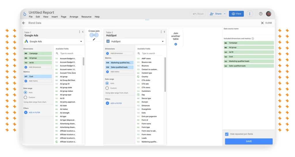
“Create a blended data source and organize your data.”
Now we’ve added Google Ads, we need to repeat step #2 to add the CRM so we can “blend” data between the two platforms.
Resource > Manage Blends > Add a Blend > Edit Blend
For this exercise, we’ll focus on determining Cost Per Marketing Qualified Lead. Let’s also assume the company is only running ads on Google Search.
At this point, we’re ready to start adding our dimensions and metrics. In this example, we’ve added “Campaigns,” “Ad Groups,” and “Ad IDs” as dimensions and “Cost” as our metric for Google Search. Next we’ll use “Marketing Qualified Leads” and “Sales Qualified Leads.”
Last, we’ll use the “Cross Join” function so both platforms can speak to each other.
Pro-tip: “Cross Join” allows Looker to interpret metrics from both platforms for use in equations that allow the user to create custom metrics (i.e. cost-per-MQL).
Step #4: Select Visualization Graph & Data Source
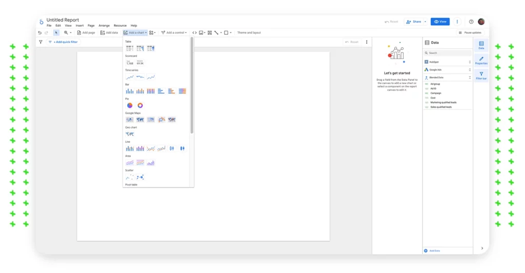
“Create a visualization for the blended data.”
What I’d consider the second easiest step of the entire process: selecting a chart that best meets your needs. Perhaps you’re looking for a table that displays multiple metrics and dimensions, or something less intricate like a “scorecard” that displays a single metric.
Adding a chart is easy, simply hover over “add a chart” and select your desired visualization.
Pro-tip: Pair a chart with a control to create an interactive visualization. For instance, you can create a “scorecard” that tracks clicks and create a “calendar control” to showcase click totals over a given period (i.e. total clicks this month).
Step #5: Custom Code Equations
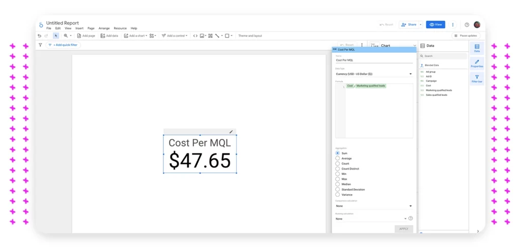
“Create your custom metrics with an equation that pulls from your data blend.”
Now that we’ve set up the scorecard, we’ll need to configure the custom metric. In this instance, since we’re looking to identify “cost-per-MQL” we’ll want to divide our cost on Google Ads by the total number of MQLs we’ve accrued within Hubspot. To do this, in our example, you’ll do the following:
Scorecard > Edit Metric > Create Custom Metric > Enter “Cost/Marketing Qualified Leads”
The equation should show a green check mark if recognized correctly by Looker. You should now have the true “cost-per-MQL” which will update every 12 hours, or whenever the platform is opened. You can also refresh the data manually at any time.
Pro tip: Change the “data type” to currency to show a dollar amount.
Data-Driven Insights Drive Informed Decisions
Navigating data integration with Google Looker Studio is a practical, cost-effective solution for marketers. It transforms complex marketing metrics into clear, actionable insights. This approach moves beyond superficial metrics, offering a clear view of informed decision-making.
With these steps, you can present data-driven narratives that resonate even in high-stakes meetings. It’s not just about number crunching; it’s about making every piece of data count for strategic, real-time decisions.


